Your great new services or products are ready to sell and you’re sure you have a hit on your hands. But even when you launch your campaigns, run your social media and Google ads, you fail to meet your sales targets.
When your online store doesn’t generate sales, your website may be at fault.
For example, messaging can affect your sales. When prospects click on an ad, they want to find the exact thing they’ve been looking for.
When your webpage is flooded with products, the client can get lost and quit buying what you’re selling. All distractions can throw your prospective customers off.
So, if possible, you want to send your shoppers on a single path, that of purchasing your service or product. We compiled a list of 4 ecommerce landing page best practices to help you in this endeavor. Let’s dive in!
What is an ecommerce landing page?
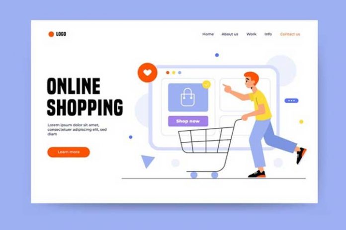
An ecommerce landing page is a page designed to increase sales by matching what your visitors search for, displaying the pros of a product and focusing on conversions by using strong CTAs (calls-to-action).
Simply put, ecommerce landing pages are essential to your marketing strategy because they convince newcomers to convert. They talk about free offerings or special offers that resonate with their wants and needs.
Basically, when compared to a home page, landing pages are made to generate more leads and sell a certain product or service.
You can try to build a landing page yourself, but if you feel that you’re better off leaving this job to someone knowledgeable, get in touch with the best ecommerce developers on the market. Professionals will help you build the best ecommerce landing pages to draw in prospective customers.
Remove site navigation
You want to keep things simple with ecommerce landing pages. Because they have the sole purpose of convincing your visitors to take action, you don’t need a navigation bar on them. Instead, you can focus on the main CTA (call to action).
Any other clickable links would only alienate your prospects and send them away from your product or service without converting them. And you want the opposite to happen.
Remember it only takes a person 0.05 seconds to form an opinion on your website. It takes 2.6 seconds for users’ eyes to land on a webpage area that affects their first impression. So, you have little time to draw them in.
Limit the clutter on your page. That means using:
- Clear headlines
- High-resolution photos
- Clear and visible CTAs
- Bullet points when describing a product/service.
A clear and concise ecommerce landing page, with as few links and clutter as possible, increases your conversion odds.
Also Read: How To Place Your eCommerce Site In The First Google Results?
Emphasize your CTAs
It’s possible that some visitors won’t know exactly what to do after they arrive at your ecommerce landing page. A good idea is to include a clear and precise call to action (CTA).
The call-to-action is a big visible button that enables visitors to easily discover and do what you want them to.
A concise CTA button helps send a clear message to visitors. Moreover, it helps them focus on the goal. The button should be placed at the top of the page, and you should use active voice for the text (for instance “Sign up for free”).
Build a sense of urgency (for example “Get your free copy now”) and use multiple buttons for the same CTA throughout the page.
Regularly test your CTAs and make slight changes to check whether they increase your conversion rate.
Focus on your product or service description
Ecommerce landing pages and product pages should have clear product descriptions. But the information on your ecommerce landing pages should be specific to the audience you want to draw in, as opposed to the generic copy on product pages.
Talk to your audience in a fun and casual manner if that is the tone of voice your prospects like. Keep things simple, as descriptive as possible, and easy to understand.
Don’t make your visitors look for information on your product or service. Instead, make sure it’s visible throughout the page. The offer description should be clear and noticeable, possibly placed before the CTA button. Then, focus on the description and reviews.
Optimize your page for mobile devices
Optimize your website (and ecommerce landing page) for mobile devices. The mobile market keeps increasing year over year, so it’s an important segment of your audience.
Statista says that 56.89% of online traffic comes from mobile phones now. In the last 6 months, 79% of smartphone users have made at least one purchase online.
It’s clear that mobile optimization is key to any online sales strategy.
Because many users shop using their mobile phones, having a mobile-responsive ecommerce landing page is paramount.
Focus on vertically aligned pages and formats. Mobile visitors will access your page comfortably and have a good user experience, increasing their chance at conversion.
Conclusion
These best practices should put you in the right space to begin creating landing pages that fit your audience.
Personalization has an important part to play in persuading visitors to stay on your site and convert.
Landing pages are an important part of your marketing and sales strategy. They help you advertise and sale more, leading to more revenue. But they’re not solely responsible for your success. Your entire website experience has to be top notch.
So, consider hiring one of the top ecommerce developers for the best results.
Also Read: The Role Of Logistics In eCommerce

